Craft
How a catalogue page is planned
Before a single description is written, someone has decided how many things will fit on the page. That decision governs almost everything that follows.
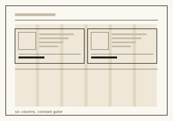
Catalogue planning runs backwards from a number. Someone decides that a section will carry, say, twenty-four items across four pages, and that decision fixes the block size, which fixes the picture size, which fixes how many words a description can hold. Writers who join the process late sometimes think the word count is an arbitrary constraint. It is the arithmetic of the page arriving in another form.
The grid is a promise about repetition
A catalogue grid is usually finer than an editorial one, because a catalogue must accommodate several block widths without redrawing the page. Six or twelve columns are common choices for the simple reason that they divide well: a six-column page yields halves, thirds and sixths, so a large item, a medium item and a small one can share a row without the gutters drifting.
Holding the gutter constant matters more than choosing a fashionable column count. The gutter is where the vertical rules live, and if it changes width between spreads the reader's eye loses the alignment it has been trained on. A catalogue whose rules move is tiring in a way readers rarely articulate.
Rows before columns
Although the grid is described in columns, catalogue pages are usually assembled in rows. A row is a set of items compared against each other; the horizontal rule beneath it says that the comparison has ended. Assembling by row keeps related things adjacent and prevents the common fault of a page where the second column continues the first column's family halfway down, so that two related items never appear at the same height.
The running head does real work
Because the reader enters at random, every page has to answer where it is. A running head carrying the section name and the page number is not decoration; it is the only navigation aid available once the index is closed. Sections that change subject mid-spread without changing the running head produce the specific frustration of a reader who is sure they have turned back too far.
Leaving room for the exception
Every range contains one item that will not behave: the thing that needs a diagram, or three extra sizes, or a warning. A grid planned so tightly that the exception cannot be accommodated forces it onto its own page, where it looks more important than it is. Experienced planners keep one double-width slot per spread in reserve, and lose nothing when it goes unused, because a slightly larger block reads as emphasis rather than as an error.
Testing the plan
- Set the longest real description in the smallest block and check it does not overrun.
- Set the shortest in the largest block and check the block does not look empty.
- Print one spread at final size and read it at arm's length, which is how it will be used.
- Check that the specification lines of adjacent items sit within a line of each other.
- Confirm every rule on the spread lands on a grid position, not near one.
None of this requires unusual skill. It requires doing the arithmetic before the writing rather than after it, which is the part most often skipped.